Blue Consulting - Full Branding
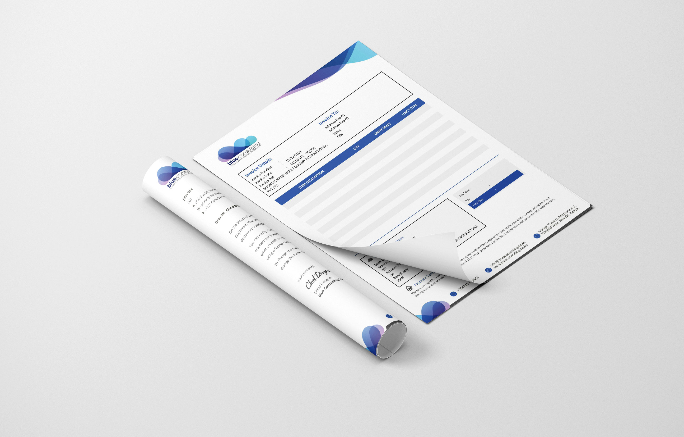
The identity is defined by a soft, cloud-like icon created through overlapping translucent gradients. The palette of violets, teals, and deep blues suggests a depth of knowledge and a calming, professional presence. The lowercase, bold typography of "blue" combined with a lighter "consulting" creates a modern visual balance, supported by a clear, action-oriented tagline: "Understand. Design. Redefine."
Project Story
Challenge
Consulting firms often suffer from a "stiff" or overly formal image that can feel unapproachable. The goal was to create an identity for Blue Consulting that felt "breathable" and innovative, while still maintaining the authority required for a high-level strategic partner.
Approach
I utilized transparency and layering in the icon to symbolize the multi-dimensional nature of problem-solving. Each overlap creates a new shade, representing the collaborative "synergy" between the consultant and the client. The rounded shapes evoke a sense of global connectivity and fluidity, moving away from sharp, aggressive corporate angles.
Outcome
The final identity is both ethereal and grounded. It stands out in the consulting sector by appearing more like a creative powerhouse or a tech-forward firm. The logo communicates that the brand doesn't just provide "off-the-shelf" advice but builds custom, layered solutions that evolve with the client.
Project Gallery
Want something like this for your business?
Browse the available services or send a message to discuss your next project.