Engine Oild Refinery LLC - Logo Design
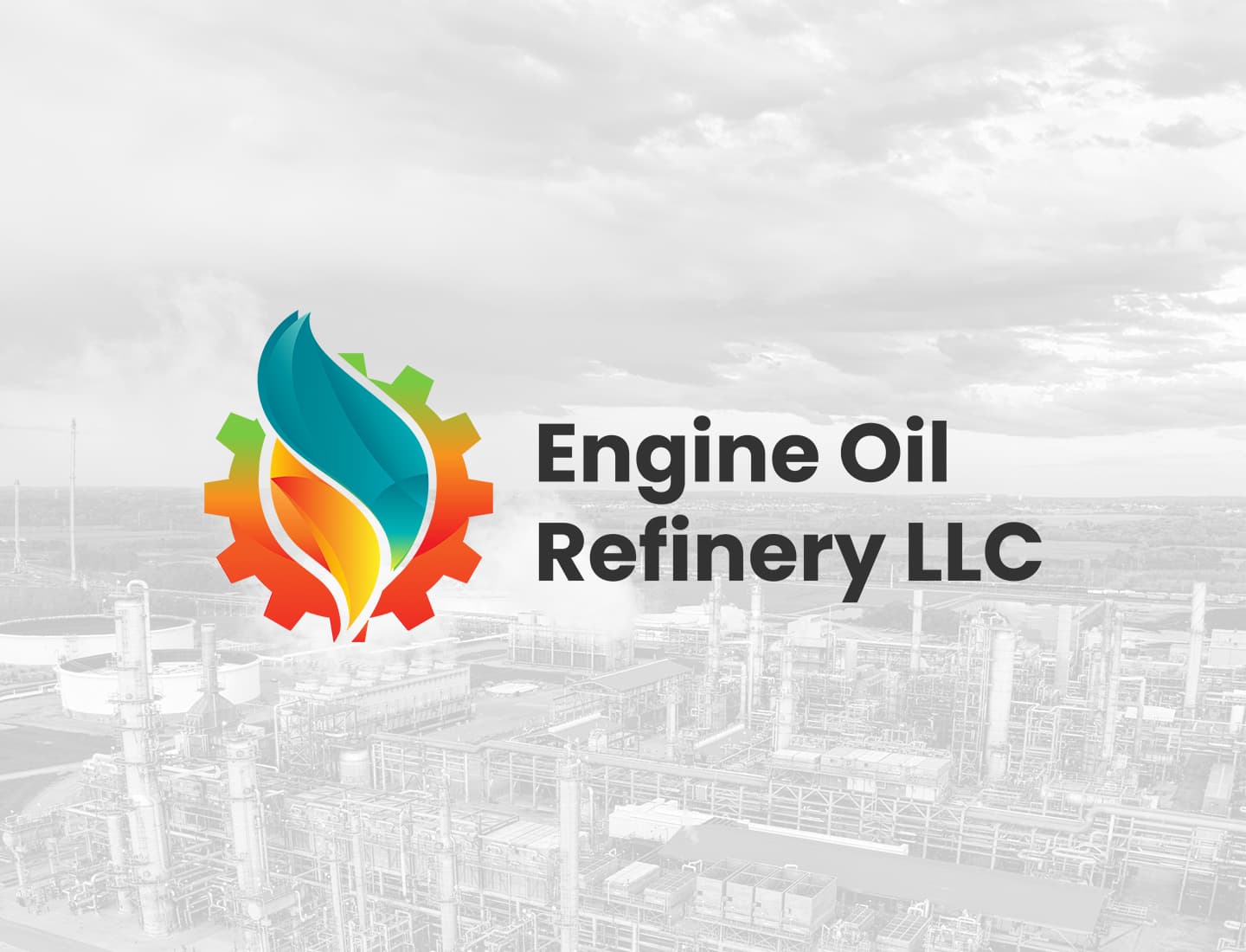
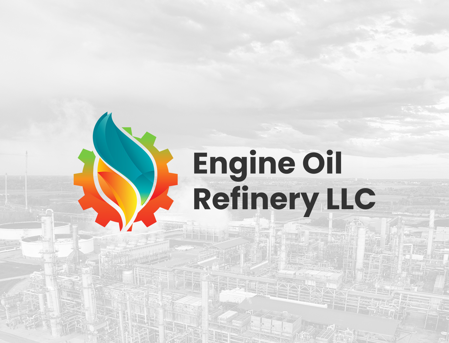
The identity features a dynamic icon where a stylized droplet emerges from a mechanical gear. It uses a faceted flame or fluid design that transitions from fiery oranges and yellows to a cool, crystalline teal. This represents the actual refining process: taking raw energy and perfecting it into a high-performance lubricant. The bold, dark typography provides a solid anchor that keeps the whole look feeling grounded and professional.
Project Story
Challenge
Most brands in the oil and gas sector rely on heavy, dated imagery that can feel a bit stagnant. My goal was to create something for a refinery that highlights precision and high-tech filtration while looking modern and forward-thinking.
Approach
I decided to pair the gear, which is the universal symbol of machinery, with a faceted fluid droplet. Those facets within the drop are there to suggest molecular precision, almost like the oil is being engineered at a microscopic level. By playing with contrasting color temperatures warm vs cooI could visually tell the story of protection against heat and friction.
Outcome
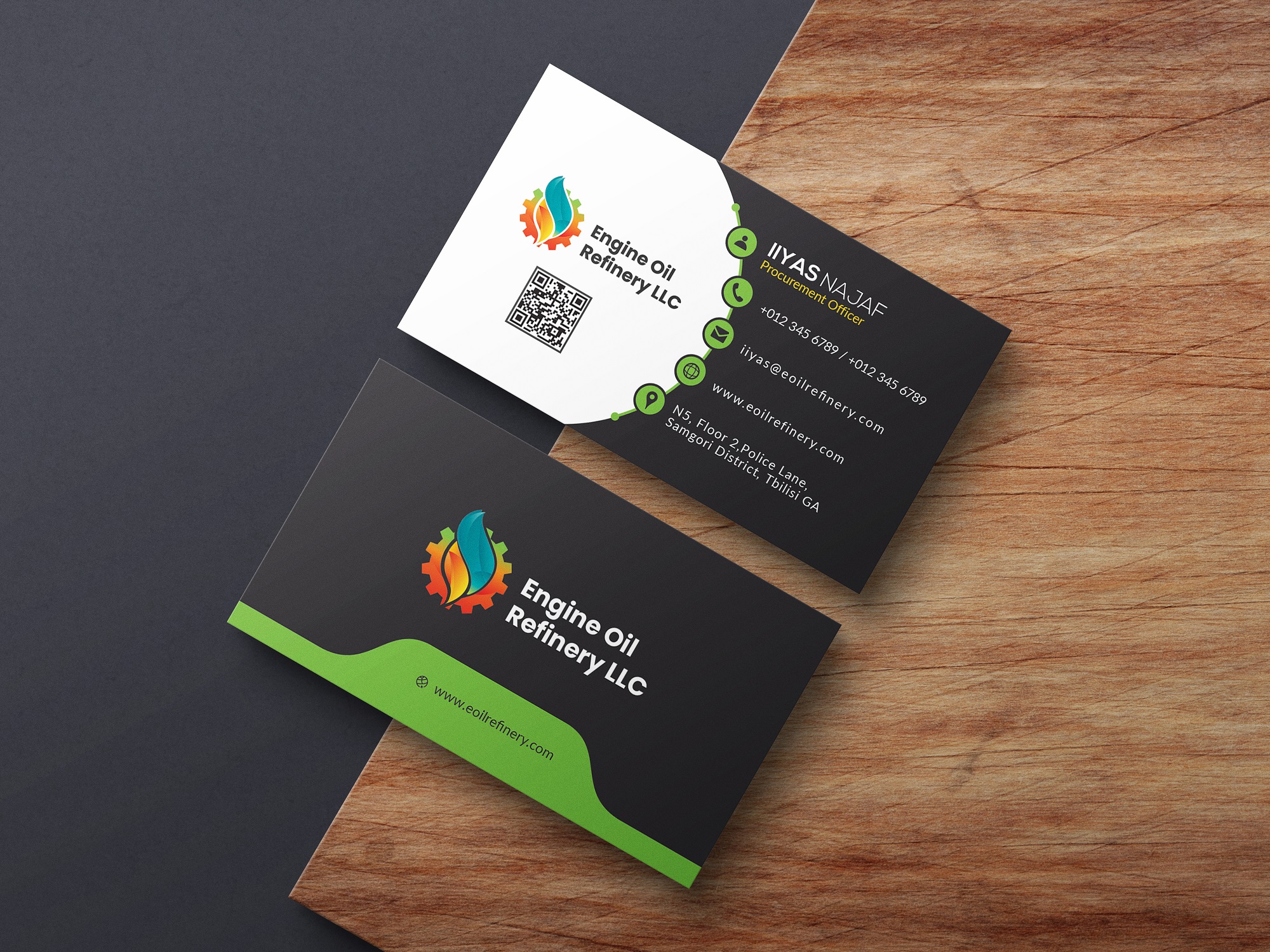
The final identity projects premium quality and industrial reliability. It positions Engine Oil Refinery LLC as a modern facility using cutting-edge tech to produce superior products. The logo is versatile enough to look great on everything from massive fuel trucks to sleek digital corporate profiles.
Project Gallery

Want something like this for your business?
Browse the available services or send a message to discuss your next project.